Disctopia

Introduction

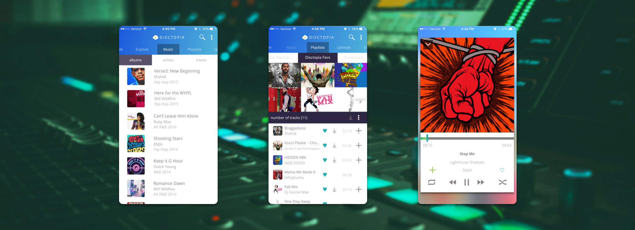
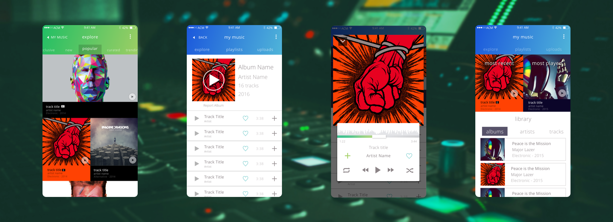
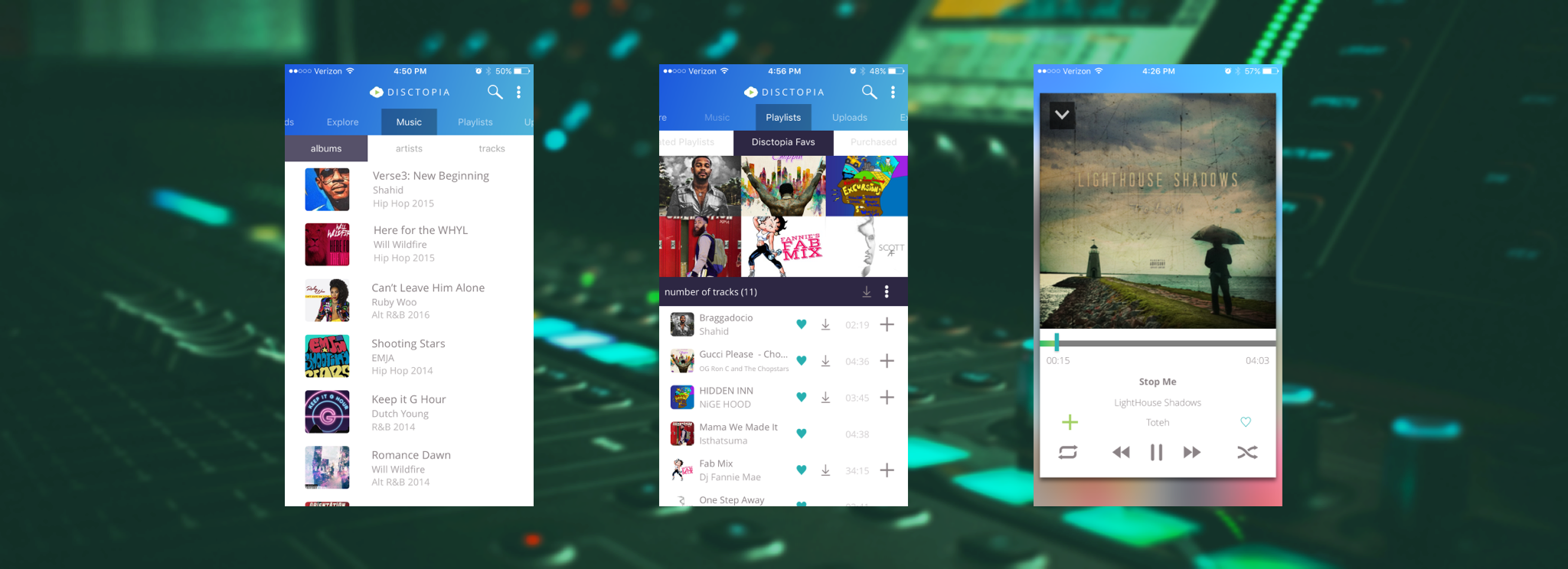
Disctopia is a platform dedicated to indie music artists and creatives so that they can showcase and sell their work, including entire music albums to podcasts. At the same time, fans can listen to and purchase artists’ work and curate their own playlists.

At the time I was introduced to it, Disctopia only existed as a web browser experience. This was not a good business strategy for Disctopia because, like users on many other services, their audience primarily listened to music on their phones. A native app for Android and iOS devices was the best solution to reach a wider audience.

Early Explorations

I had a head start from the previous designer who had made some lo-fi wireframes. It became clear that I would need to go back to scratch, starting with rough thumbnails in a sketchbook.

Working with those thumbnails, I broke down the app into several sections which could be organized further using repeatable list patterns that featured the artists’ album art. Similar list patterns had come up repeatedly during my competitor research into other music-player apps.

Building off of my thumbnails, I created a high-fidelity draft of the app for review by the owner of Disctopia. After the review, we went through several versions of this first draft, simplifying the design to be better focused to showcase the artists’ music and ease more users into purchasing music. Most of this process was focused on making the buying process as easy as possible and boiling down the music player component into a clean showcase of the artist's album art.

The Final Designs

The first high-fidelity draft went through several iterations, which streamlined the experience each time. The component tiles holding each piece of music were restructured to be the same size so they could be easily repeatable throughout the app by the development team.

Features such as “Most Recent” and “Most Played” were left out as they were ultimately determined to be less useful for the user compared to other features and were taking up precious space in the experience.

Instead, users got the ability to download music from the app to their devices and the music player was trimmed into one continuous shape, instead of two rectangles pushed together.

This would be the design that would eventually launch with the first version of the app.

Conclusion

Disctopia was trying to provide many things at once and more time was required to get it focused on the right information architecture. Users should be able to find everything through natural discovery, but shouldn’t be overwhelmed all at once or they would abandon the app. The challenge here was to find that balance and I needed to do a few more iterations to actually reach that point. But as a first mobile project? Not a bad attempt.

Previous Project
Next Project