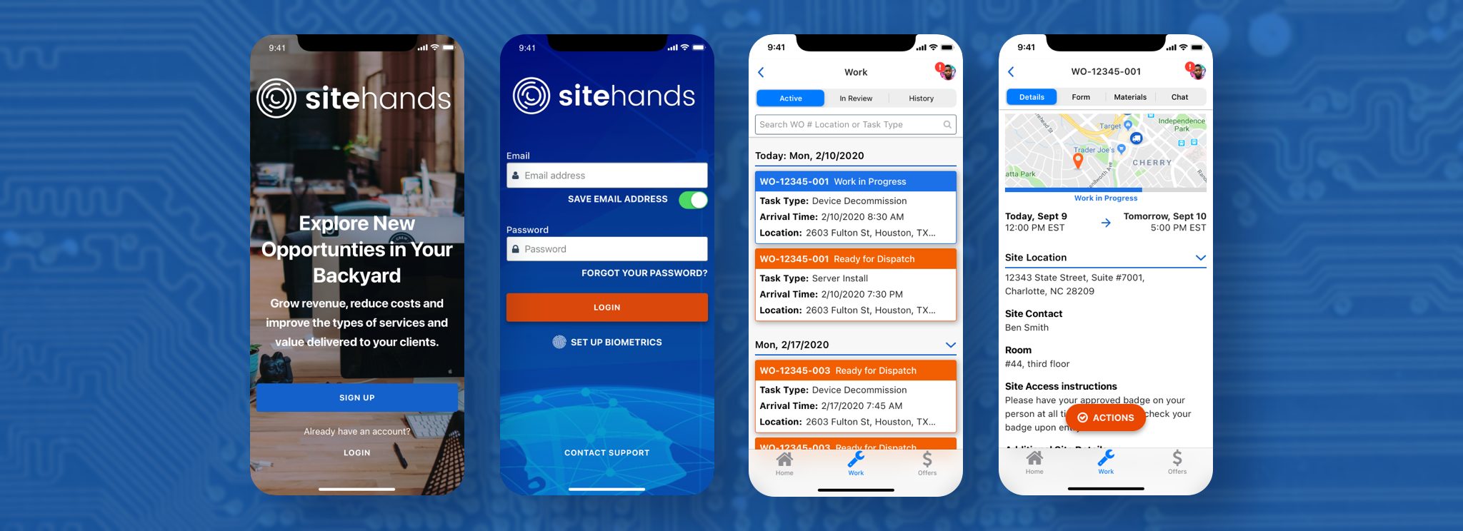
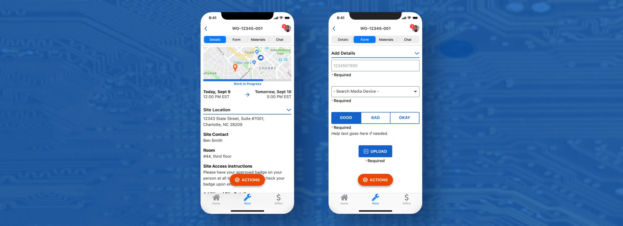
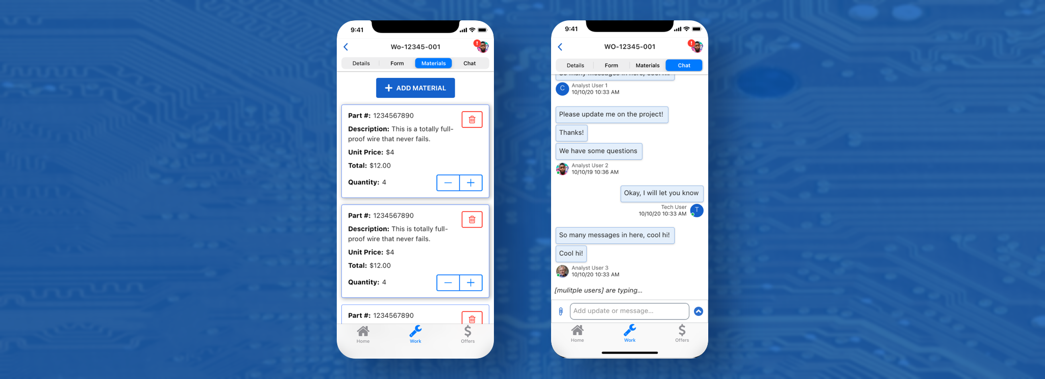
Third, the Materials tab, is optional, depending on the job; it hosts an index of materials that the technician can search through and add any material that they may need to complete the job.
And the last tab, Chat, allows communication between the technicians and analysts, who act as liaisons between the technicians and clients, and can answer questions or concerns.
Digging deeper into actions
The biggest part of the Work Order screen is the Actions button. This button holds a variety of actions that the technician can take depending on the status of the Work Order. Through the button, any needed actions had to be available at all times, on all parts of the Work Order (except the chat window and Materials tab).
After iterating through multiple designs, I landed on using a FAB (floating action button, borrowed from Google's Material Design system). The design got buy-in from stakeholders after successful rounds of testing with employees in the office on a mobile Sketch prototype.
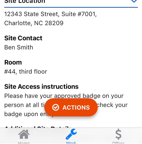
Actions button - default
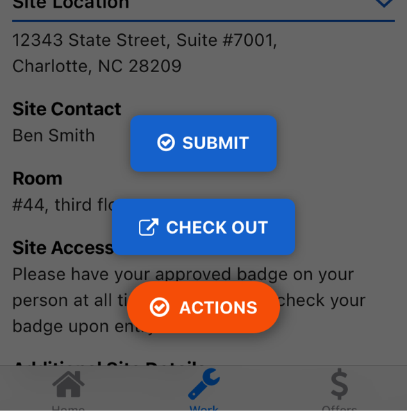
Actions button - active
Keeping things organized
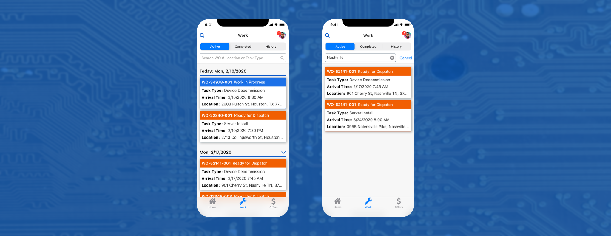
With the Work Order screen completed, it was time for the next challenge: how to keep technicians aware of how much work they had been assigned and when was work supposed to be completed? What if they were late to a job site? They needed a place to keep track of their work orders.
The older design was a simple, unorganized list of card components. Leadership loved the card component, but they recognized the card component was crowded and it was difficult to parse information quickly on each card. Additionally, having all the cards in one single list created excessive scrolling.
Knowing the above, I wanted to understand what information on the card was absolutely needed and what could be discarded. I sat down with stakeholders and started a discussion to determine this.
The stakeholders and I pared down the information to five essential things:
- The Work Order number — Technicians and Analysts both used these numbers to keep track of work.
- The status of the Work Order — The technicians needed to know where in the life-cycle of a work order they were.
- Task type — The kind of work would the technician be doing.
- Arrival time — The time the client (who had requested the work) needed the technician to be on the job site.
- Location — Technicians need to know where the job site would be.
Additionally, I put together a special LATE status for when the technician was late to a job site. It was also important to use the status label to tell the technician how to resolve being late (by checking in).
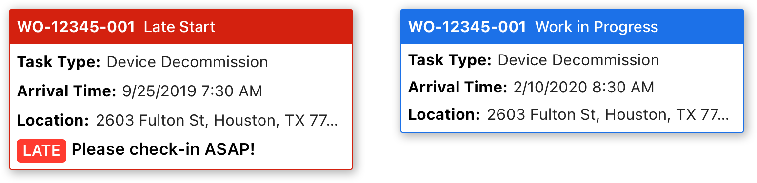
A Work in Progress and a Late Work Order card
Now that I had a viable card component, how to organize them became the next focus. More discussion on this topic with stakeholders resulted in placing a bar of tabs at the top the screen. These tabs would sort the cards by whether a job was active, finished or closed. The tabs were named to reflect this: Active, Completed and History.
The solution reduced the number of cards on one screen, and with the addition of a search bar, it was easier to find specific cards, but it was still a lot to read at once.
I discussed this with another stakeholder and together we landed on using collapsable sections that would sort work order cards by the day and date. The jobs that the technician had that current day, however, could not be collapsed, and so they were always open at the top of the screen.